- Posted on : April 14, 2023
-
- Industry : Corporate
- Type: Blog

Introduction
In this tutorial I’ll present how Power BI can be used to work with data pulled from a secured REST API. I will assume there is an API that has a GET method returning JSON data with dummy logs. To get this JSON response payload, you would need to authorize first and send the GET request with a valid access token. Then you would need to handle the JSON response in Power BI and build a proper data model. At the conclusion, you would be able to create a nice-looking dashboard for data analysis.
Authentication
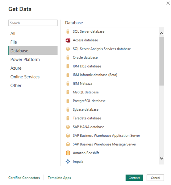
Power BI is a great tool with many wizards and templates. But sometimes when you need to create a custom, secured connection to an API requiring an access token in the header, it isn’t so easy. Power BI has many templates that make connections to different data resources like files, databases and other resources, as shown below:
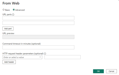
Unfortunately, configuring a custom connection to a secured API is less configurable and can’t be generated automatically. Especially when you need to first and send custom headers or a . In these instances, you may have some problems configuring it with a wizard:
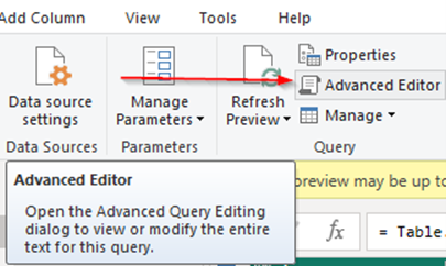
To make it work, use “Advanced Editor” in the “Transform data” tab and write some scripts:
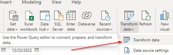
After clicking “Transform data,” the new window appears, and you would need to click on “Advanced Editor:”
Let’s assume you have some endpoint for authorization where you need to credentials to get an access token. Then this access token would be used in the next step to get the JSON data response.
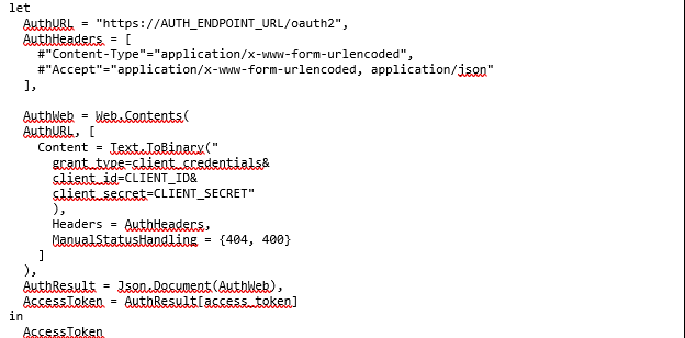
That’s one of the methods you may employ, depending on the kind of authorization your API uses. This example gives you a starting point and an overview of how to address the issue.
JSON response
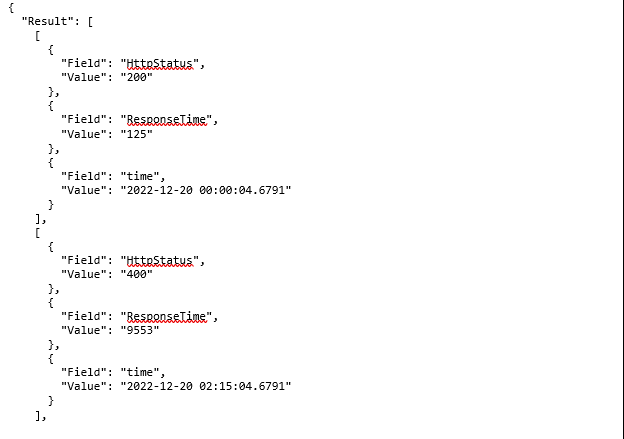
In an API GET response there will be a big JSON object with single property Result. The Result represents an array of objects. The smallest objects inside arrays have two properties, “Field” and “Value.” For lay people, at first sight, it is readable and well-organized. But as we delve in we will see building a data model in Power BI won’t be that straightforward. It will require some transformations, using Power BI M query scripts.
Step-by-step data transformation
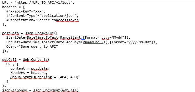
- Send a request to REST APINow, let's create a proper payload using the GET method with the access token attached in header. As a response, we should receive a JSON object with a Result property, and data we would like to process next.
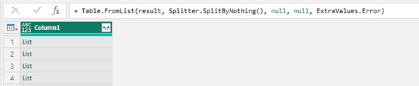
- Parsing and converting the JSON response into a single columnIf the API accepts our request and responds properly, can convert it to a single-column. From this:

To this:
- Expand the List into the recordsNow expand all the List objects into Record objects. Upon completion, you will still have a single column. Observe that there will be three times as many records. This is because all properties from JSON were expanded in that single column. Again, from this:

To this:
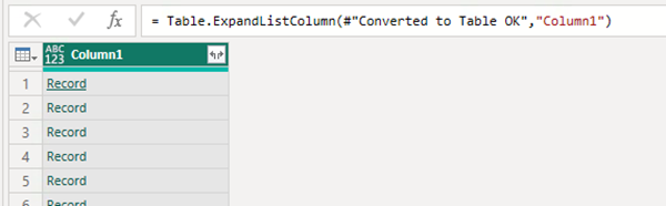
Here are the number of records before and after conversion:


- Expand all records into a two-column tableNow we expand all Record objects into two columns. The first, called “Column1.Field” would have property keys. The second, “Column1.Value,” would have all values from JSON.Here is the code:

Here is the result:
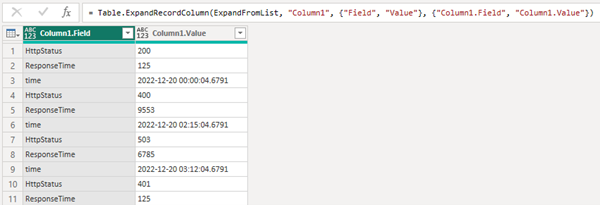
We drilled down to the lowest level and reached the properties field, value of the JSON resource. At this point there is no possibility to analyze and build anything from such data model. As you can see above, all keys from the JSON output are stored in “Column 1” and all values above are in “Column1.value .”
Our goal would be to transform this data model to something like the example below. To do that, we should select and group all keys from Column 1 and use it as a header in new, pivoted table. The next steps will guide you through building proper relations between records, resulting in a new table with “HttpStatus,” “Response Time” and “time” in the header. With such a data model you are free to make your analysis as shown later in this article.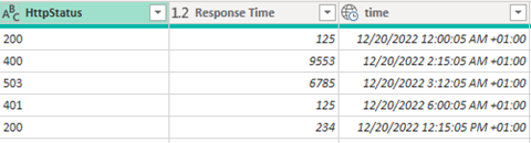
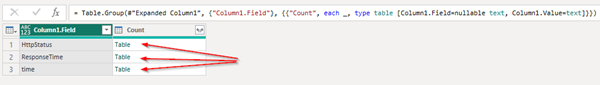
- Grouping data by Column1.FieldWe now roll-up the data using Group By function, and it will be applied on Column1.Field, taking the Table objects in Count column like this

Resulting in this:
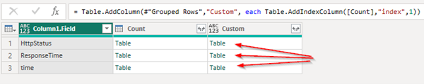
- Adding an indexing columnNow add a new column. This will have Field, Value and index created based on Table objects inside the “Count” column from the previous step. This:

Represents as this:
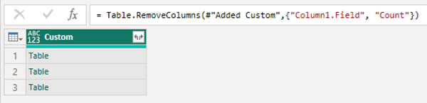
- Removing unused columnsAll the necessary information is the Column1.Field, so we can now remove, Column1.Values like this:

Resulting in this:
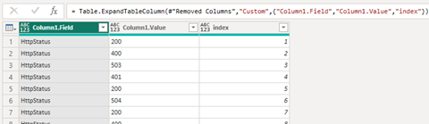
- Expanding new column CustomAfter doing this, we will index the data showing a key relation between all properties “HttpStatus,” “ResponseTime” and “time,” so we can employ pivot tables later. The code:

Results in this:
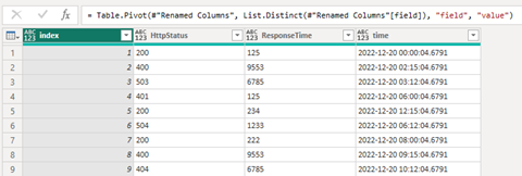
- Renaming and pivoting columnsPivoting the table readies it for Power BI features. The code:

The result:
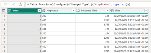
- Renaming and changing fields typeAdjust the field names and change the field types to date, text and number like this:
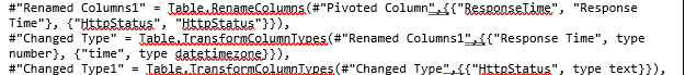
For this:
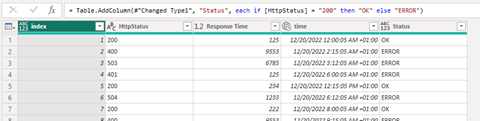
- A final (but not necessary) stepAdd one conditional column, where 200 errors would be marked as OK and all others as ERROR, like this:

To display like this:
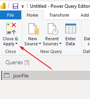
Now, we can click on “Close & Apply” and go to the building dashboard tools.
Building Power BI dashboard
With the data in this format, we can now use Power BI tools for presentation.
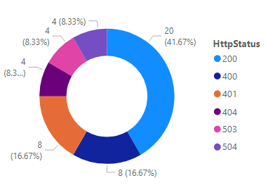
- Creating a Donut chart.Let’s make a Donut chart showing the total percentage amount of http statuses. Pick a Donut chart from visualizations and drag and drop the “HttpStatus” field into “Values: and “Details” input fields:
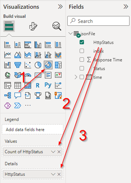
You should almost immediately see the visualization:
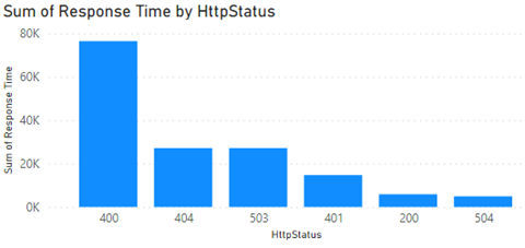
Creating Column chartYou present the data differently. Let’s pick the Column chart from the Visualizations toolbox:
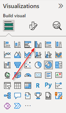
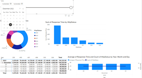
Then create a chart showing summarized response time divided by type of status. So, for this place “HttpStatus” into the “X-axis” and “Sum of Response time” into “Y-axis” fields:
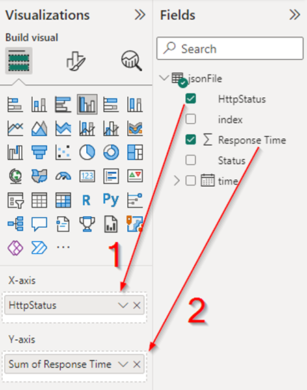
To get this:
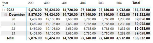
- Creating Matrix tableA matrix table is a powerful tool that can save time when working with numbers and aggregations. If you wish to make a table with summarized response times and divide by date and type of http status you could do it this way:
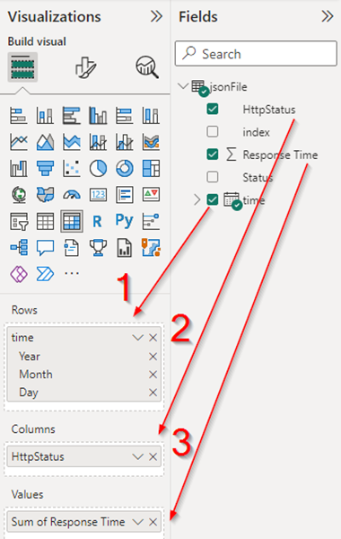
Which will render a table with all aggregated calculations by date and type of status codes:
- Adding date slicerThis tool allows filtering by date and time range to all objects in the dashboard. Just pick the date slicer and add the time field:
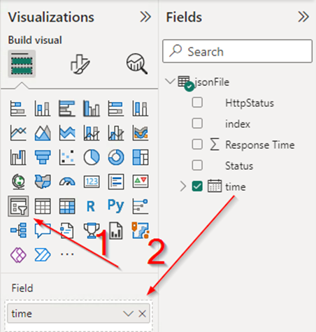
Then, you can pick a date range and automatically adjust all objects in the dashboard:
Conclusions
Power BI is powerful. It allows us to work with different data sources. Building something custom might seem daunting and require some study, but the result is worth the effort.
About the Author

Artur Banul
Artur is a Senior Software Engineer at Infogain and has over 20 years of experience in the IT industry. His valuable experience spans across various technology-oriented roles, including that of a Programmer and a Database Specialist. Artur has worked for some established companies during his career but eventually he founded his own company and worked as freelancer for some international projects, before joining Infogain Poland. With his rich technical expertise to advance business capabilities, Artur is motivated to deliver the best possible solutions and help his clients achieve transformative business outcomes.